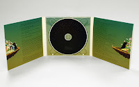
What is a Digipack?
A digipack is a trademarked product firstly made by MeadWestvaco. They are made out of cardboard or any other heavy paper material designed to hold and protect CD's. There are a few different designs to this type of CD packaging; it can either be flipped open like a book e.g. like a normal jewel CD case or there is the three panel digipack design which means the CD is placed in the center of the packaging so this time there is a left and a right panel to be flipped open, this allows more room for multiple CD storage and album cover art.
 A normal Jewel CD Case on the left.
And a three panel CD case on the right.
This first album cover by Ministry of sound, of whom I have mentioned in my blog previously I really like. The cover is simplistic and powerful. On most of Ministry of sounds album covers the logo is very big and bold however with the black and white theme, the lips and small logo it is a powerful design. The logo is meant to represent a heart, to say 'I love garage' however the logo replaces it which is a quirky technique that I really like.
This next album cover by Disclosure again follows the black and white theme which I like. The two separate type faces; Disclosure (face template) and Caracal really compliment each other as it follows the chalk on chalkboard effect. You will also notice that the Caracal has the Disclosure white face over the top of it. This is a unique effect that features in some of their videos and other album cover which I like the direct link in between.
Gorgon City being my artist of choice had the have a mention and as a matter of fact I do like the album cover for 'Lover Like You'. The cover has a brighter green/turquoise colour to it with a women swimming underneath the water. What I like about the cover is that it has nothing to do with the song and this makes is unique. I Like the Times Roman typeface that Gorgon City always stick too as well.
'Beauty Behind the Madness', was released in 2015 and was the biggest album released by The Weeknd. The cover has a black and white face with The Weeknds face on the front of it. It almost looks like his face was cut up and stuck on which was is effective and could depict the stresses that he went through the make the album and the amount of cuts it took. The yellow font sticks out and makes it unique.
My final album cover of choice again by Ministry of Sound is one of their old school album covers which just shows their history. The over features a large Ministry logo like I mentioned previously. The colour scheme of the cover is purple with two pink and yellow lights on the side and a reflection which is different to the others of my choice. The album states in the corner 'Anthems', so once you've seen that you know exactly what it is you are buying.
Another different concept of digipack that I loved was this more interactive one that Rudimental play at the start of some of their music videos in the 'Home' Album. This clip at the end, as a motionless picture is actually their album cover. However they have expanded the idea turning it into a time lapse effect that pans downwards from the sky. It then does actually pause at he end giving details of the album etc. Such a clever idea and one I have never seen before.
 A normal Jewel CD Case on the left.
And a three panel CD case on the right.
Research into famous Digipacks
Below I have chosen a selection of Album covers that I can gain inspiration from when shooting my music video and hen I made my own digipack. They each say a lot about the artist of artists featured within the video.
This next album cover by Disclosure again follows the black and white theme which I like. The two separate type faces; Disclosure (face template) and Caracal really compliment each other as it follows the chalk on chalkboard effect. You will also notice that the Caracal has the Disclosure white face over the top of it. This is a unique effect that features in some of their videos and other album cover which I like the direct link in between.
Gorgon City being my artist of choice had the have a mention and as a matter of fact I do like the album cover for 'Lover Like You'. The cover has a brighter green/turquoise colour to it with a women swimming underneath the water. What I like about the cover is that it has nothing to do with the song and this makes is unique. I Like the Times Roman typeface that Gorgon City always stick too as well.
'Beauty Behind the Madness', was released in 2015 and was the biggest album released by The Weeknd. The cover has a black and white face with The Weeknds face on the front of it. It almost looks like his face was cut up and stuck on which was is effective and could depict the stresses that he went through the make the album and the amount of cuts it took. The yellow font sticks out and makes it unique.
My final album cover of choice again by Ministry of Sound is one of their old school album covers which just shows their history. The over features a large Ministry logo like I mentioned previously. The colour scheme of the cover is purple with two pink and yellow lights on the side and a reflection which is different to the others of my choice. The album states in the corner 'Anthems', so once you've seen that you know exactly what it is you are buying.
Another different concept of digipack that I loved was this more interactive one that Rudimental play at the start of some of their music videos in the 'Home' Album. This clip at the end, as a motionless picture is actually their album cover. However they have expanded the idea turning it into a time lapse effect that pans downwards from the sky. It then does actually pause at he end giving details of the album etc. Such a clever idea and one I have never seen before.


